Hello, I'm Mili. I'm a Fine Art student at Sunderland University.
Here are some of the artists I am inspired by.
EVELYN DE MORGAN
This is a piece by the artist Evelyn De Morgan, one of my favourite artists and my favourite painting. The Watts Gallery in Surrey had a small exhibit on the art of William and Evelyn De Morgan's - this is where I found the piece shown here. The De Morgan's studio was a few minutes away from the gallery - this is where most of their artwork was stored.
De Morgan lived from 1855 to 1919 and began her artistic career as part of the Pre-Raphaelite movement. She mainly worked in portraiture, however she took on a project to build a small chapel constructed entirely out of hand painted tiles, each one created by a local group of women in her area.
Each of De Morgan's works is incredibly detailed and has an individual atmosphere. This painting feels calm and peaceful, which offsets the darker and more melancholic themes of the painting.

EILEEN SOPER
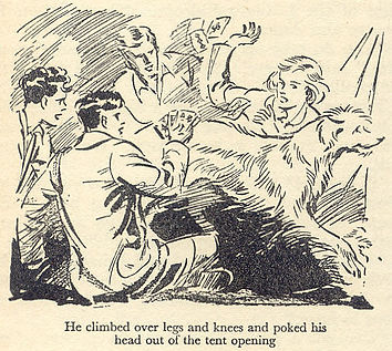
Eileen Soper is a talented illustrator, most well known for her work illustrating the book series by Enid Blyton; 'The Famous Five'. I grew up reading these books and was always enamoured by the illustration accompanying them. Even though Soper used line art throughout the series each image is incredibly animated and dynamic.
Soper also did a lot of work in portraiture, one of her paintings "Eric Liddell, 1902-1945. Athlete and Missionary" (1925) is displayed at the Chris Beetles Gallery in Scotland. She was very fond of depicting people and animals and was typically relatively minimalistic with her backgrounds but the textured detail that goes into her characters is one of my favourite things about her work.
As shown in this image, especially in the design of the dog ("Timmy"), Soper was skilled at creating movement from line work, with what I would assume was a brush pen. With brush pens an artist becomes capable of creating very expressive lines, giving her illustrations an emotional atmosphere.
SOPHIE STANDING
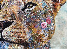
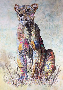
The artwork of Sophie Standing is remarkable. She takes photographs of (mostly) African wildlife and re-creates their likeness on cotton, she then uses a needle and thread to detail each image. This means that her textile pieces are incredibly unique and detailed.
Standing focuses on African wildlife as she lived in Africa for fifteen years after moving from England where she was born. She uses her art to enhance the natural beauty of the animals she encountered.
The floral detail is exquisite and consistent throughout the piece - I've included a zoomed in version of the Lioness piece as the stitching is very clear around the face.
Each textile piece I've encountered by Standing has been stunning and one of kind - I hope that I have the opportunity to create something similar.
VINCENT VAN GOGH
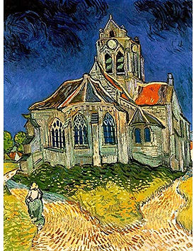
Van Gogh was an incredible artist who had an incredibly unique and vivid way of looking at the world, reflected by the boldness of the colour choices and brushstrokes. To see the world through his eyes must have been incredible - so filled with swirls and smudges of vibrant colour. Pieces like "Starry Night" and "Sunflowers" are two of his most famous paintings, and for good reason, but I decided to display a less popular one - "The Church at Auvers".
"The Church at Auvers" was an oil landscape that Van Gogh painted in 1890 and now hangs in the Musée d'Orsay in Paris. He created a series of pieces while he was staying in Saint-Rémy-de-Provence, such as the town hall and several thatched-roofed houses in Auvers.
Van Gogh's post-impressionistic style was very unpopular during his lifetime, however now his painting "Starry Night" is estimated to be worth over $100,000,000. Most of his painting sales while he was alive was via his brother Theodorus Van Gogh, an accomplished art dealer. After Van Gogh's (somewhat suspicious) death, most of his paintings were sold by his brother.
G. F. WATTS
I came across George Fredrick Watts when at the Watt's gallery in Surrey - there were plenty of pieces to chose from but I though this one was the most poignant.
Watts was very against cruelty to and the hunting of birds - he once was commissioned to paint a woman who wore a feather in her hat while sitting to be painted. Watts refused to paint her with it and plucked it from her hat before starting.
The piece is called "A Wounded Heron" and was painted to be a message against the poaching of birds. This is clearly meant to be an emotive piece with the intent of evoking an empathetic response in the viewer. The heron's visible eye is looking directly out of the painting to plead with an onlooker, and the pale whiteness of the feathers is to symbolise innocence. Byron wanted a viewer to feel that what happened to the Heron was an injustice and to dissuade someone from letting it happen again. I find this painting to be moving and was struck by it immediately after finding it in his gallery.

MICK PETER
I first came across Mick Peter's work when his exhibit "To Me; To You" was shown at The BALTIC Centre for Contemporary Art in September 2019. Peter has a specific style of illustration that, while simplistic, still manages to immerse anyone walking through the exhibition.
Structured like a comic book, this exhibition guides a visitor through a simple plot of three people attempting to move a large avocado into an exhibit. At the very end of his 'comic' the viewer can find a "sneak peak" of where the avocado had been moved to through a crack in the barrier next to a sign; "Gallery Closed for Installation". I found this exhibit and Peter's style of work to be fun and unique, and would revisit "To Me; To You"
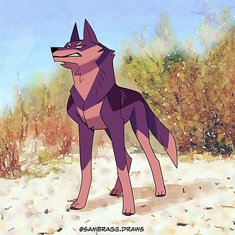
SAM BRAGG
Sam Bragg is an artist I found online - she is the author and illustrator of a webtoon comic as well as running successful art blogs on social media sites such as Instagram, Tumblr, e.c.t..
Bragg is an artist with a very distinctive style and, I believe, is very talented at illustrating animals. I am continuously fascinated by the simplicity and expressiveness of each character.
Additionally, she is a digital artist. I'm not sure which programme she uses but the effortless way in which she blends line art with bold colours, with fascinating backgrounds to tie a piece together. This combines itself well with her clear skills in character building. For example, this character is clearly intended to be interpreted as standoffish and proud. This is mainly apparent in his expression, however the confident puff of his chest and the way that he holds his head high and his ears at attention support this idea.

GRETEL LUSKY
Gretel Lusky is an illustrator and comic artist that works with a range of mediums. I have always been impressed by her range and her ability to create such detailed pieces and give character and personality to an image.
This piece, for example, is a standalone image, it isn't part of a comic or story, but the cold fury in this character's face is piercing and clear. The chaos of the background adds life to the piece and creates an atmosphere of storm, this is linked to the character through the unusual glow of the eyes.
There is a clear connection between the character and the albino jackdaw on her arm - the birds feathers match her eyes and the feathers on her dress link to birds.
At face value this drawing seems rather cut and dry but there is always something deeper in her work, simple but effective and beautiful.
Gallery Exhibitions:
I recently went to the BALTIC Centre for Contemporary Art and was particularly fascinated by this exhibit; "Against Time", by Huma Bhabha. I couldn't find much online about the artist so here is my interpretation of her work based on what I found out and the impression some of her pieces made.
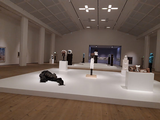
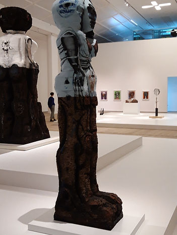
Upon entering the room the exhibit is structured to draw a visitors attention to the sculptures in the middle of the room. They mainly consist of humanoid figures carved from cork and polystyrene. They are minimally painted with bold colours and details added with an airbrush in some places. The second image is a clear example of this technique.
I was particularly drawn to the smaller section at the back.

These two were my favourite pieces of work in this section. There's something so desolate about them. The monochromatic nature of each drawing gives it a sinister tone.
Bhabha was originally born in Pakistan in 1962 and lived there before moving to America in 1985. The 1970s were a time of war and chaos in Pakistan, and while I can't find Bhabha's exact location but I believe that the conflict inspired this section of the exhibition.
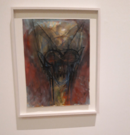
Most of the walls of the exhibition were lined with characters incredibly similar to this one. Each figure is grotesque and seems threatening. Images, such as this one, are erratic and seemed rushed, as if Bhabha was desperate to put it on paper, to get the image out of her head and onto paper where it became real, tangible, no longer having the power of a spectre over her.
However, this is all solely based on my assumptions and impressions that I am making purely off of the basic biographical information I was able to find on her. The lack of information creates an impression of mystery, however I'm sure this is as she's a lesser known artist, rather than a conscious choice.
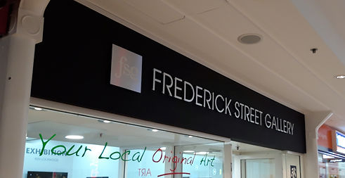
FREDRICK STREET GALLERY
Inside of The Bridges, right by the Priestman building, there's a small gallery that presents the work of local artists. When the situation had allowed it I frequently went to visit it. I took pictures of particularly memorable pieces last time I was there

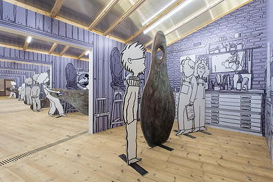
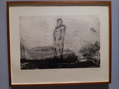
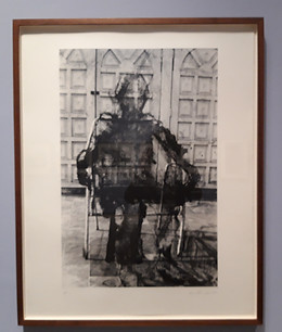
These are two connected pieces by the local artist Graham Hodgson, in chronological order the one on the right is entitled 'Maxime Operis Sui', and then on the right is 'Iron Heart'. I find them both to be beautiful and interesting. 'Maxime Operis Sui' shows a young man standing before an iron heart being constructed - one that will be strong enough to withstand this world, and 'Iron Heart' shows the same man, much older, standing in front of a heart, rusted and battered, missing panels and long neglected, but still strong as iron.
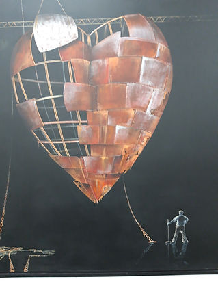
'Maxime Operis Sui'
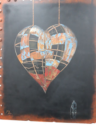
'Iron Heart'
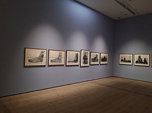
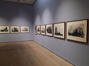
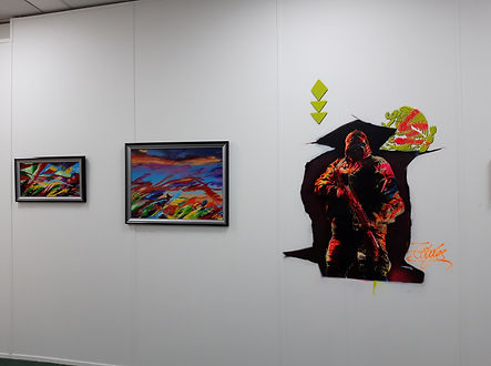
This is a wall of artwork that I unfortunately couldn't find the name of the artist aside from the stylised signature in the bottom corner of the larger piece - I just thought they were wonderful.
.jpg)
.jpg)
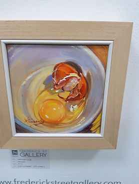
As well as just displaying the work of local artists the Fredrick Street Gallery also sells artist's work such as these paintings and a rack of beautiful prints that people can flip through and purchase. These paintings are all beautiful - but the first one is my favourite.